What this is for#
Every campaign you send generates a report with 6 tabs and a dozen numbers. Most of the time you only need 4 of those numbers — but knowing where the other 8 live (and why they matter) is the difference between "the campaign worked" and "the campaign got opens but no clicks, here's the fix."
This is the orientation tour: where every metric in the AcelleMail campaign report lives, what good looks like, and what to do when a number's off.
Open the report#
After a campaign sends, click its name from the Campaigns index. You land on the Overview tab, which is the right place to start for every campaign.
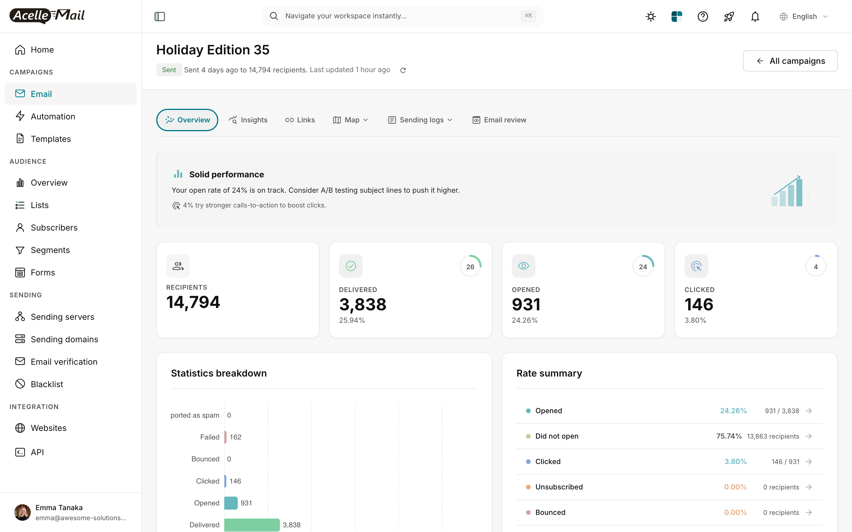
The 6 tabs in this report:
| Tab |
What's there |
| Overview |
The 4 headline numbers + statistics breakdown + rate summary — read this first |
| Insights |
AI-generated analysis ("subject worked but CTA underperformed") |
| Links |
Per-link click breakdown — which CTA actually drove the clicks |
| Map |
Geographic distribution of opens and clicks |
| Sending logs |
Per-recipient delivery status (sent / failed / bounced) |
| Email review |
The actual email HTML as subscribers received it |
Most decisions are made from Overview + Links. Use the others to drill down.
The 4 headline numbers (Overview tab)#
The stat cards are the order metrics matter in. Read them left-to-right.
1. RECIPIENTS#
The size of the audience the campaign was sent to. Pulled from your list + segment + any exclusions.
Use this to sanity-check the next number. If you sent to 15,000 but only 3,800 are "delivered," something's wrong with delivery (not engagement).
2. DELIVERED#
How many emails actually reached an inbox (subscriber's mail server accepted the message). The percentage shown — "3,838 (25.94%)" — is delivered as a share of recipients.
| Delivered % |
Diagnosis |
| >97% |
Excellent — list is clean, sender reputation healthy |
| 92-97% |
Normal — a small portion bounces on every list |
| 80-92% |
Warning — your list is going stale OR you've hit a deliverability problem |
| <80% |
Crisis — STOP sending, run list hygiene, check sending domain auth |
Why "Holiday Edition 35" shows 25.94% delivered? Because it was sent to 14,794 recipients but only 3,838 are "delivered" — the rest are still being processed, or it's a partial send. For a finished campaign you'd expect 92%+. Always read the campaign's "Last updated" timestamp to know if numbers are final.
3. OPENED#
Unique opens — how many recipients triggered AcelleMail's open-tracking pixel by loading images. The percentage is opens as a share of delivered (not recipients).
| Open rate |
Status |
| >30% |
Excellent — strong subject line + relevant audience |
| 20-30% |
Good — solid program |
| 15-20% |
Average — room to improve subject + sender name |
| <15% |
Poor — audit subject, sender reputation, list freshness |
Caveat: Apple Mail Privacy Protection inflates this number for ~30-45% of subscribers. See Open rates in the age of Apple MPP. For most modern lists, the "real" open rate is 30-50% lower than what the dashboard shows.
4. CLICKED#
Unique clicks — recipients who clicked at least one link in the email. The most reliable engagement signal because it requires real human action (not just image-loading).
| Click rate (CTR) |
Status |
| >5% |
Excellent — content + CTA pulling together |
| 2-5% |
Good — typical for well-targeted lists |
| 1-2% |
Average — CTAs probably need work |
| <1% |
Poor — content or audience mismatch |
Click rate is the metric to optimise most heavily. It's the proxy for "did this campaign cause action?"
The Rate summary (Overview tab right side)#
The right-side panel restates the headline numbers as percentages with absolute counts in parentheses:
| Row |
What it means |
| Opened |
Same as Opened stat card — share of delivered who loaded images |
| Did not open |
The complement — recipients who delivered but never opened |
| Clicked |
Same as Clicked stat card — share of opens (not delivered!) who clicked |
| Unsubscribed |
Share of delivered who unsubscribed from this campaign |
| Bounced |
Share of recipients whose delivery failed |
Two important nuances:
- The Clicked row shows clicks as % of opens (the click-to-open rate / CTOR), not % of recipients. CTOR is a better measure of content quality than CTR because it isolates content from subject-line effect.
- The Unsubscribed and Bounced rows are absolute — anything above 0.5% on either is a warning.
Healthy targets:
| Row |
Healthy |
Warning |
| Opened (as % delivered) |
20-40% |
<15% |
| Clicked (CTOR — % of opens) |
10-25% |
<5% |
| Unsubscribed |
<0.5% |
>1% |
| Bounced |
<2% |
>5% |
Statistics breakdown chart (Overview tab left side)#
The bar chart breaks every status into absolute counts:
- Delivered — top bar, largest
- Opened — middle, smaller (subset of delivered)
- Clicked — small (subset of opened)
- Bounced / Failed / Reported as spam — bottom rows, should all be near zero
The bars give you a visual sanity check: opens should be 20-40% of delivered; clicks should be 5-20% of opens. Anything dramatically off says something's wrong upstream.
The "Insight banner" — AcelleMail's quick read#
Above the stat cards, AcelleMail shows a one-line insight banner. In the screenshot above:
"Solid performance — Your open rate of 24% is on track. Consider A/B testing subject lines to push it higher."
The banner pulls from the actual numbers and recommends the highest-leverage next action:
| Banner verdict |
Typical recommendation |
| Strong engagement |
"Try stronger CTAs to lift clicks" |
| Solid performance |
"A/B test subject lines" |
| Mixed results |
"Audit list hygiene OR re-segment audience" |
| Underperformed |
"Run re-engagement first, then re-send to remaining" |
It's not a substitute for thinking, but for a quick read at the top of the report it's accurate.
When to drill into each other tab#
| If you want to know... |
Open this tab |
| "Which CTA worked best?" |
Links — per-link clicks ranked |
| "Where geographically did opens/clicks come from?" |
Map |
| "Did the email actually get delivered to my own inbox?" |
Sending logs (search your email) |
| "What did the email look like in the wild?" |
Email review |
| "Should I follow up on this campaign?" |
Insights (read AcelleMail's analysis) |
Each tab has its own deep-dive article — start with Overview, drill in only when a specific number raises a question.
What good looks like overall#
A "healthy" campaign report (well-built audience, decent content, no deliverability issues):
| Metric |
Healthy benchmark |
| Delivered |
>97% of recipients |
| Open rate |
20-30% (or higher; inflated by MPP) |
| Click rate |
2-5% of delivered |
| Click-to-open rate (CTOR) |
10-15% |
| Unsubscribe rate |
<0.5% |
| Bounce rate |
<2% |
| Spam complaint rate |
<0.1% |
Hit these consistently and your sender reputation stays healthy, which keeps your inbox placement strong, which compounds across every future campaign.
When numbers are bad — what to do#
| Symptom |
Likely cause |
Fix |
| Low delivered % |
List hygiene problem OR sending-domain auth issue |
Run list hygiene; audit SPF/DKIM on your sending domain |
| Low open rate (and not just MPP) |
Weak subject, wrong send time, sender-name issue |
A/B test the subject line + from name |
| High open / low CTR |
Subject promised something content didn't deliver, OR CTA is buried |
Re-write body to lead with the promised value; bigger / brighter button |
| High bounce rate |
Old list, imports without verification, OR sending-server problem |
Run email verification on the list before next send |
| High unsubscribe rate |
Frequency too high, content irrelevant, OR list bought rather than opted-in |
Reduce cadence, segment, or run re-engagement |
| High spam-complaint rate |
Buying lists is the #1 cause — even one purchased segment poisons the whole list |
Immediately suppress the offending segment; future sends slow-warm only |
Common questions#
| Question |
Answer |
| Why does the dashboard show 14,794 recipients but only 3,838 delivered? |
Either the campaign is mid-send (read the "Last updated" timestamp), OR there's a deliverability problem. Re-check in 1 hour. |
| My open rate suddenly dropped from 30% to 15% — what happened? |
Most commonly: sender reputation took a hit (a recent bad send), OR a major ISP changed how they count opens (this happens). Check the previous 3 campaigns' rates to spot the trend. |
| Why is CTR ≠ Clicked-card-percentage? |
CTR can be calculated as clicks / delivered OR clicks / opens (CTOR). AcelleMail's Clicked stat card uses clicks / delivered. The Rate summary "Clicked" row uses clicks / opens. They're both valid — just know which is which. |
| The "Opened" map shows 931 opens but the stat card says 931. Where's the discrepancy I'd expect? |
No discrepancy here — both reflect unique opens. The map plots their geographic locations; the card counts them. |
Related articles#
