What this is for#
"Click analysis" in AcelleMail is split across two tabs of the campaign report. Most other ESPs call this a Click Map and conflate them; AcelleMail keeps them honest:
| Tab |
What it shows |
Use when |
| Links |
Per-URL click breakdown — which link in the email was clicked, how often |
"Which CTA worked best?" |
| Map |
Geographic distribution — where in the world the clicks happened |
"What's our reach?" |
There is no in-email layout heatmap (a visual overlay showing "people clicked here on the email image") in AcelleMail. The Links tab is the substitute: it groups clicks by URL, and since your email links to different URLs from different blocks, you can infer layout effectiveness from URL data.
This article walks through both tabs.
The Links tab — which CTA actually worked#
Open any sent campaign → Links tab. URL pattern: /campaigns/{uid}/links.
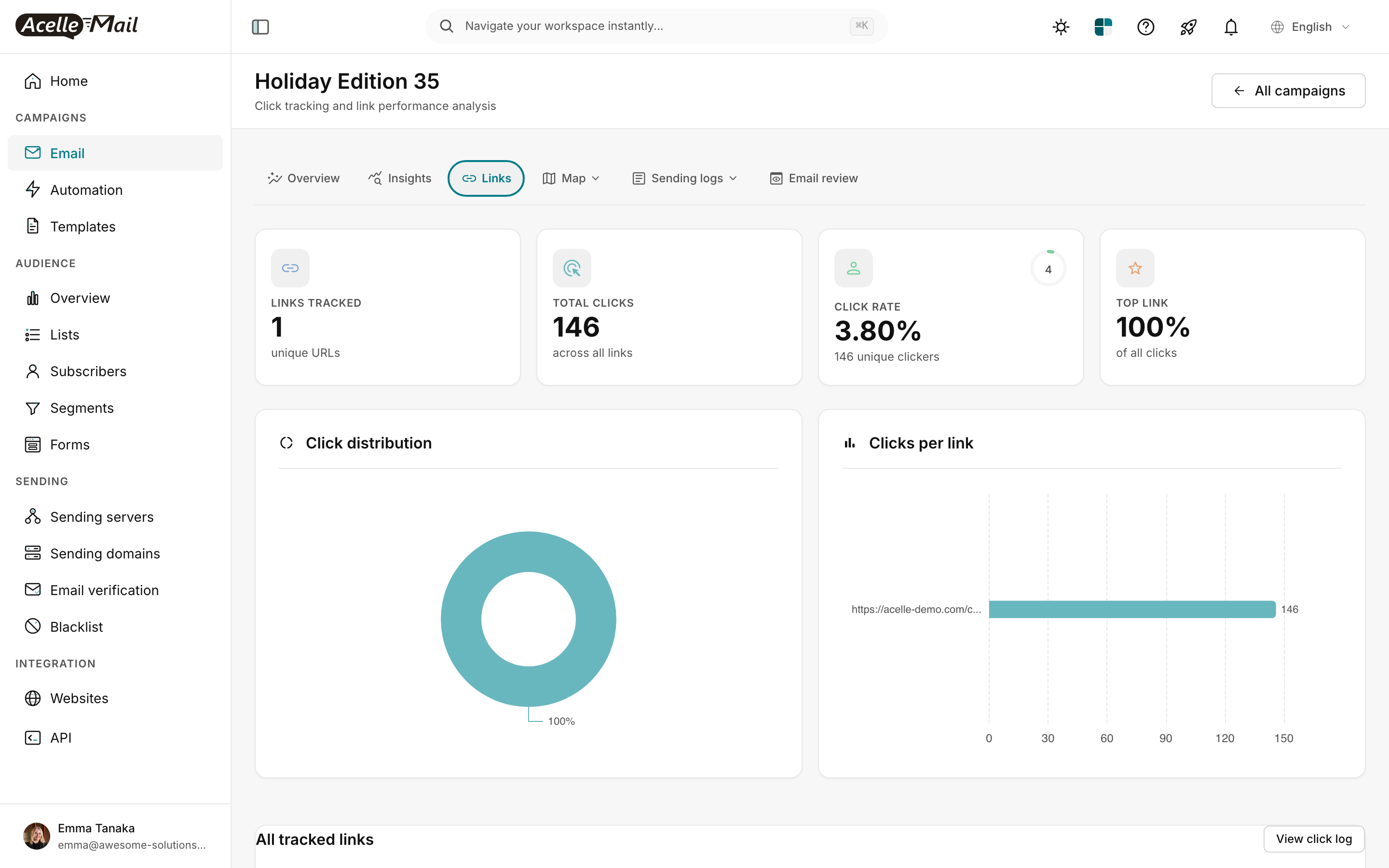
The 4 cards at the top:
| Card |
What it means |
Healthy range |
| LINKS TRACKED |
How many unique URLs your email contained |
1-5 (more dilutes attention) |
| TOTAL CLICKS |
Sum of all clicks across all links |
Use as denominator only |
| CLICK RATE |
Unique clickers / delivered |
2-5% is healthy |
| TOP LINK |
% of total clicks captured by your best-performing link |
60%+ = focused message; <30% = scattered |
TOP LINK is the most diagnostic. If 100% of your clicks go to one link, your email had one job and did it. If clicks are split across many links (TOP LINK at 25%), the message was too scattered.
The two charts side-by-side#
- Click distribution (donut) — visual share of clicks per URL. Hover to see counts.
- Clicks per link (bar chart) — ranks URLs by absolute click count. Top bar = best-performing CTA.
The "All tracked links" table#
Scroll below the charts to see the raw table:
| Column |
What it shows |
| URL |
Full destination URL |
| Clicks (unique) |
Different subscribers who clicked this URL |
| Clicks (total) |
All clicks including duplicates (one person clicking twice) |
| CTR |
Clicks as % of delivered |
| First clicked / Last clicked |
Time of first and most recent click |
Hard insight: if Clicks (total) is significantly higher than Clicks (unique), some subscribers clicked the same link multiple times — strong signal of high interest in that destination.
Pattern: deliberately track multiple URLs#
A campaign with only 1 URL tells you nothing about WHICH part of your email worked. Build campaigns with 2-3 distinct URLs to learn:
| Block |
URL |
Purpose |
| Headline image |
yoursite.com/?utm_content=hero |
Top-of-email engagement |
| Body CTA button |
yoursite.com/?utm_content=cta |
The primary action |
| Footer text link |
yoursite.com/?utm_content=footer |
Bottom-scrollers |
After the campaign, the Links tab tells you which of the three got the most clicks. Iterate by:
- Hero pulled more clicks than CTA → image is your real CTA; make it more obviously clickable
- Footer link pulled significant clicks → some readers skip to the bottom; put your offer there too
- CTA pulled most clicks → your email did its job; replicate the layout
Use UTM parameters on the URLs so you can also trace this in your site analytics. See Setting Up UTM Parameters.
The Map tab — geographic click distribution#
Switch to the Map tab. URL: /campaigns/{uid}/click-map.
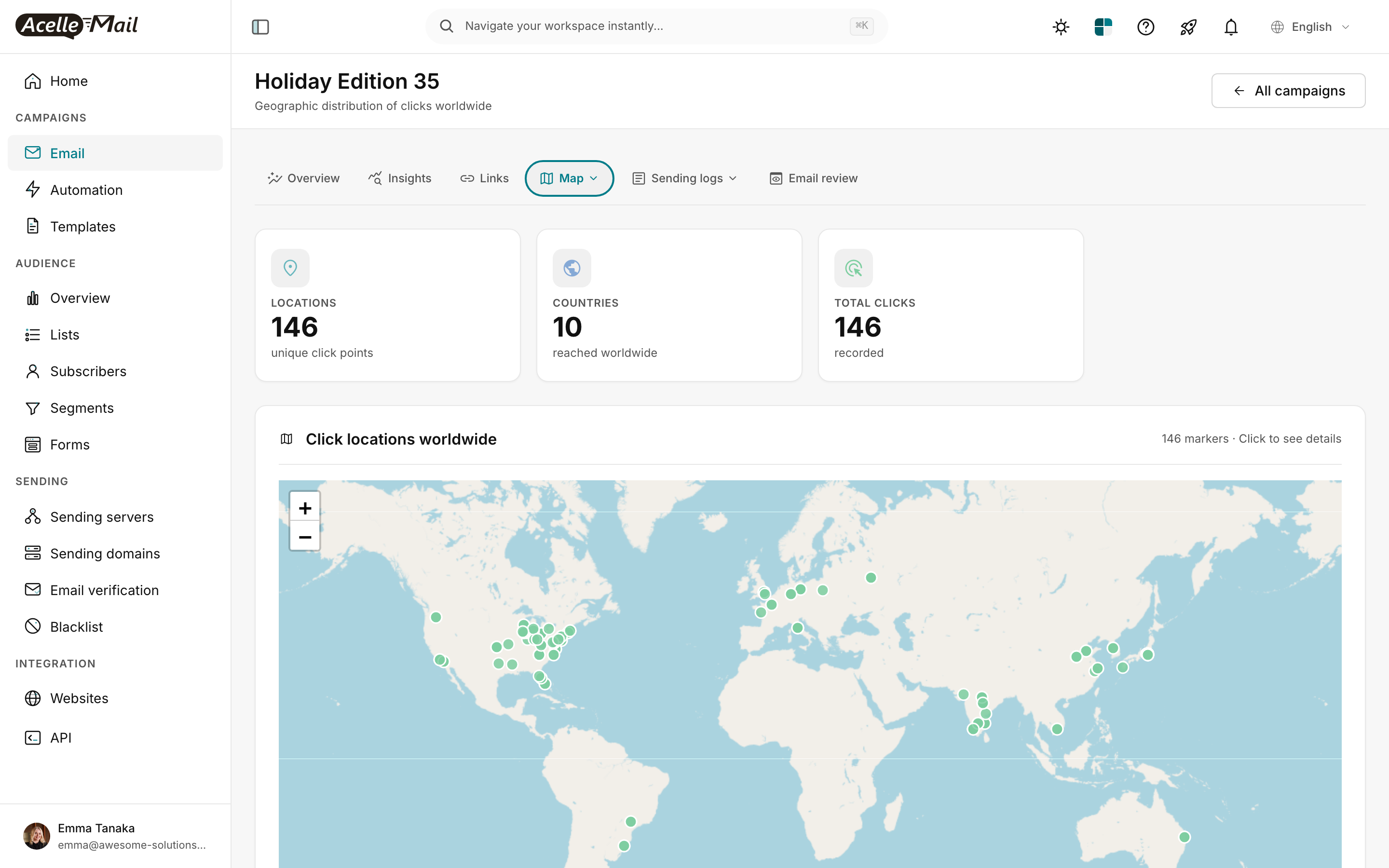
The Map tab tells you 3 things:
| Card |
Use |
| LOCATIONS |
Number of unique click points — same as TOTAL CLICKS in most cases unless multiple clicks from the same IP |
| COUNTRIES |
Geographic reach. 10 countries means your audience is global; 1 country means localised. |
| TOTAL CLICKS |
Same number as on Links tab — cross-reference |
The world map plots each click as a green dot at the click's IP-geolocation. Click any dot for details (subscriber email, time, URL clicked).
What to learn from the map:
- Single-country audience? Schedule campaigns for that country's prime time (see Campaign Scheduling).
- Two-continent split? Build segments by region and send separate campaigns timed to each.
- Unexpected geographic cluster (a tiny country with disproportionate clicks)? Investigate — could be a viral share, an unsubscribed-then-resubscribed cluster, or a bot.
Geographic data isn't perfectly accurate. IP geolocation is approximate, and Apple MPP routing makes Apple Mail subscribers' "locations" all show as Apple's data centers (mostly US). For most campaigns, treat country-level data as accurate, city-level as a rough guide.
Combining Links + Map for diagnostic reads#
The two tabs together answer specific questions:
| Question |
Where to look |
| Which CTA worked? |
Links — TOP LINK + Clicks per link chart |
| Did the audience match our targeting? |
Map — COUNTRIES + dot distribution |
| Why did the campaign underperform? |
Links — if all clicks went to footer, your hero didn't hook them |
| Should we localise? |
Map — if 90% of clicks are in 1 country, yes |
| Is there click fraud / bot activity? |
Map — clicks all from one obscure location, OR all clicks within 30 seconds of send |
Layout optimisation — without an in-email heatmap#
Since AcelleMail doesn't render a visual layout heatmap, you reconstruct it from URL data + your knowledge of where each URL appears in the email.
Practical workflow per campaign:
- Plan link placement before send. Note in a spreadsheet which URL appears in which block:
URL 1 — yoursite.com/?utm_content=hero       → headline image (top)
URL 2 — yoursite.com/?utm_content=primary    → primary CTA button (mid)
URL 3 — yoursite.com/?utm_content=secondary  → secondary text link (lower)
URL 4 — yoursite.com/?utm_content=footer     → footer
- After send, compare click counts. Higher click count = better-performing block.
- Iterate: if footer URL got 30% of clicks despite being last, move that messaging higher in the next campaign.
After 5-10 campaigns of this pattern, you have a "layout heatmap" specific to your audience — derived from data, not assumed.
Common issues#
| What you see |
What to do |
| LINKS TRACKED says 1 but my email had 5 links |
The 4 missing links probably weren't tracked because click-tracking was off when you sent. Check the campaign Setup step → Tracking section. |
| CLICK RATE on Links tab differs from Overview tab |
Different denominators. Overview "Clicked" stat = unique clickers / delivered. Some derived metrics use total clicks / unique opens. Read the percentage label. |
| Map shows all clicks in 1 location |
Either small list / local audience (expected), OR your tracking is being filtered by a proxy. Check the Apple MPP article for proxy IP patterns. |
| TOP LINK is 100% but you had multiple CTAs |
All other links got 0 clicks. Bad sign — your other CTAs didn't even register. Make them visually distinct + offer different value. |
| Sudden spike in clicks from one country you don't sell to |
Possible click bot. Audit the open log for IP patterns; consider blocking that IP range if it persists. |
| "View click log" returns sparse data |
Click log only shows actual click events. A campaign with 5 clicks shows 5 rows; sparse means low engagement, not a bug. |
What NOT to do#
- Don't put 10 links in one email to "spread the bet." High link count dilutes attention. 1-3 distinct destinations max.
- Don't read absolute click counts. A campaign to 1,000 with 50 clicks is excellent (5% CTR); a campaign to 100,000 with 200 clicks is poor (0.2% CTR).
- Don't optimise location-targeting from a single campaign's Map data. Geographic patterns need 3-5 campaigns to be reliable.
- Don't ignore the Time of first-clicked. A 0-second first-click is bot-suspicious; legitimate clicks usually arrive minutes-to-hours after send.
Related articles#
